 Photo by Signature Pro on Unsplash
 Forms – why correct implementation is so important?
- Przejdź do artykułów z tagiem accessibility
- Przejdź do artykułów z tagiem accessible form
- Przejdź do artykułów z tagiem forms
- Przejdź do artykułów z tagiem WCAG
Article content
What are forms?
Forms are used for user interaction with our application, website, system. In particular, they allow for registration, login, purchase, or commenting. Based on digital accessibility guidelines described in the WCAG 2.1 standard, forms require special attention.
Most common errors:
- Lack of autocomplete.
- Lack of grouping for sets of complex form fields (fieldset and legend).
- Lack of visual and programmatic marking of required fields (required, aria-required).
- Lack of field labels and/or linking labels to fields (label).
- Lack of error message association with fields (aria-describedby).
1. Lack of autocomplete
Filling out forms with the same data every time is a waste of time. People with disabilities often have difficulty using more complex forms. Especially with entering dates. The autocomplete attribute comes to the rescue. Properly used, it significantly speeds up and facilitates the completion of text fields, input data, or appropriately sets selection lists.
The list of available attribute values is quite long and allows you to create a form in such a way that the user will receive many suggestions. And ideally, they will only need to accept the automatically filled form.
However, it is also important to recognize the risks associated with uncontrolled autocomplete, ie. in login and password during login. In this case, the user should decide whether the fields should be filled in for them.
Due to its complexity, this topic is worth discussing in more detail in the future.
2. Lack of grouping for sets of fields
We are used to describing photos and tables with captions, which we group with these photos and tables respectively. Also, when it comes to forms, it is a good practice to group fields into sections.
Let’s look at the form we fill out when shopping online. It usually consists of several sections. We have the buyer’s data, delivery address, and there is also a place for invoice data. Now, let’s assume we are ordering goods for a friend. Let’s imagine that the fields are not separated in any way. It will be easy to make a mistake by entering the buyer’s (our) data in the delivery address field, and the shipment will not arrive at the right address.
To organize related form controls, fieldset and legend tags are best suited. Thanks to them, we can group text fields easily and clearly. We can also create a set of checkboxes with additional options such as SMS notification, delivery by 12:00, or gift wrapping.
3. Lack of marking for required fields
When filling out a form, not all fields are always mandatory, but those necessary for saving the form must be visually and programmatically marked.
The first aspect is usually well resolved. Most often in the form of special characters (*) or additional text in the field label (e.g., required field). Unfortunately, the programmatic definition of required fields is often omitted. The required attribute and aria-required are best suited for this purpose. This is particularly important for people who use screen readers and may not visually notice highlighted labels.
Additionally, proper marking of required fields is directly related to the errors that may occur after completing the form.
4. and 5. Lack of labels and linking error messages with fields
After we have filled out the entire form, we want to submit it. At this point, it may turn out that we forgot to fill in a required field. We made a mistake and entered a phone number that was too long. Or maybe we didn’t fill out the form at all. In such a situation, we should be informed about what needs to be corrected. It would be good for us to also receive information about why the value we entered is invalid.
In the vast majority of cases, forms display messages informing us that something is wrong. Unfortunately, they are very rarely associated with a specific form field, which makes the task even more difficult for people without disabilities. Often the content of the information provided is inadequate to the error itself and sometimes is misleading. Below is a screenshot showing one of the forms I tested.
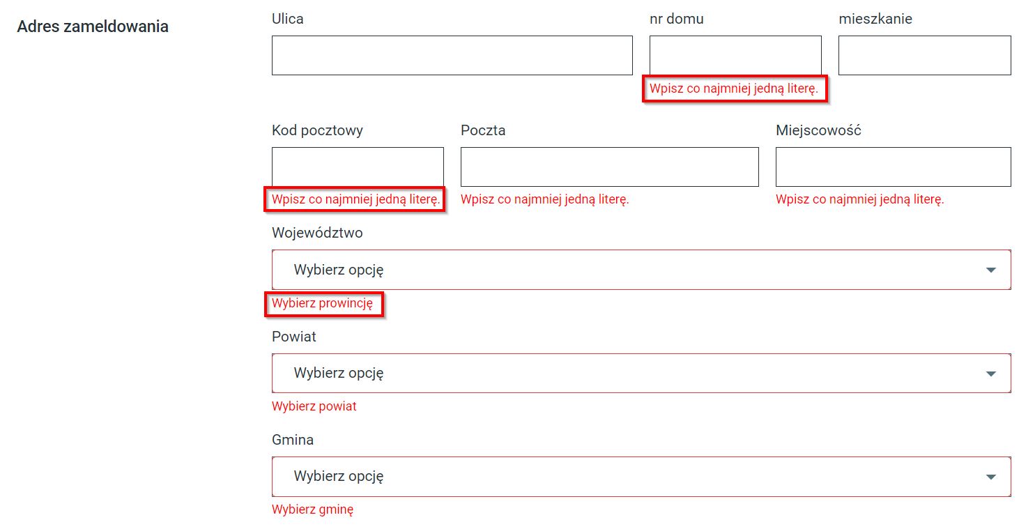
The fundamental problem in this case was the lack of associated messages, but we can also notice misleading the user (the postal code does not contain letters).
To describe discrepancies with the field, it is good to use the label for and aria-describedby attributes. The first allows us to link the label to the form field, the second to the error message. Below is an example of a proper implementation of a login form, which also takes care to move the focus to the first field, making it easier for the user to log in quickly to the service.
<div class="form-group m-form__group has-danger"> <label class="control-label m-label" for="m_login_signin_username">Adres e-mail</label> <input class="form-control m-input" type="text" aria-required="true" placeholder="Adres e-mail" name="email" id="m_login_signin_username" autofocus="autofocus" data-valid="email" value="" aria-describedby="m_login_signin_username-error"> <div id="m_login_signin_username-error" class="form-control-feedback" data-error-source="m_login_signin_username">Nieprawidłowy adres e-mail</div> </div>
Summary
Thanks to forms, we can gather the necessary data to process orders, receive feedback from customers, leave comments, or subscribe to newsletters. They are an integral part of every website or other service where the user interacts. Proper implementation will help maintain attention, speed up the purchasing process, not discourage the user from abandoning the order, and switching to the competition.

Radosław Stachurski
Accessibility Specialist & WCAG 2.1 Auditor & Quality Assurance
Recommended articles
-
 02.02.2023Accessibility
WCAG 2.1 – Criterion 1.2.3 – Audio Description or Text Alternative for Media (Recording) (Level A)
Movies accessible to everyone. Let’s imagine we have a video material that we want to publish on a well-known platform…
-
 27.07.2022Accessibility
When to use role=”presentation” and when it is not recommended
What is ARIA We have mentioned ARIA attributes several times before. But what is it and why can you often…
-
 19.02.2024Not only design
Interview about KPH website redesign
The redesign of the KPH website is completed, so I decided to pick the brain of our designer, Andrzej Dąbrowski….