
How to Create an Accessible E-commerce?
- Przejdź do artykułów z tagiem accessibility
- Przejdź do artykułów z tagiem digital accessibility
- Przejdź do artykułów z tagiem w3c
- Przejdź do artykułów z tagiem WCAG 2.1
Article content
Usually, on the Kinaole blog, we describe good accessibility practices to you so that you can use this knowledge in your industry. Today, I would like to focus on a website that has already implemented most of these practices! I’m talking about a certain Swedish giant whose furniture we can find in almost every home… 🙂
By writing this article, I hope that other online stores will understand why digital accessibility on their websites is so important, and consequently, they will make improvements in their services.
Why IKEA?
IKEA is one of the e-commerce sites that we had the pleasure of examining in terms of digital accessibility in April of this year. We released a report on the digital accessibility of e-commerce in Poland at that time (link to the page where you can download the report – Link opens in a new window. https://kinaole.co/dostepnosc-ecommerce/). IKEA ranked first in it! It achieved 73% accessibility. Today, I will show you what elements it implemented so that everyone, including people with disabilities, could enjoy online shopping equally.
Implemented Enhancements
According to research conducted by Ilknur Eren – Frontend Engineer – at Understood.org (link to the research article – Link opens in a new window. https://www.smashingmagazine.com/2022/08/organization-improved-web-accessibility-case-study/), the most common accessibility mistakes on websites are:
- low contrast for content;
- lack of alternative texts for graphics;
- empty links without context;
- lack of labels for forms;
- empty buttons without context;
- lack of language specification for the page.
Did IKEA make the same mistakes on its website?
Contrast
A criterion especially important for older people, those with low vision (Link opens in a new window. 1.4.3 WCAG). There is not a single contrast error on the store’s homepage. All content has a contrast ratio of at least 4.5:1. IKEA uses simple colors, mostly white, black, yellow, and blue, which blend together beautifully. As a result, the content on the website is readable and pleasant for the user’s eyes.

Alternative Texts for Graphics
At the time we released the report, graphics on the IKEA website were very well described or marked as decorative elements. Today, after a partial check, many errors can be noticed. I suspect (or rather hope!) that this is due to constant changes and new articles constantly being introduced on the website. However, it is clear that permanent elements have carefully prepared descriptions (Link opens in a new window. 1.1.1 WCAG).
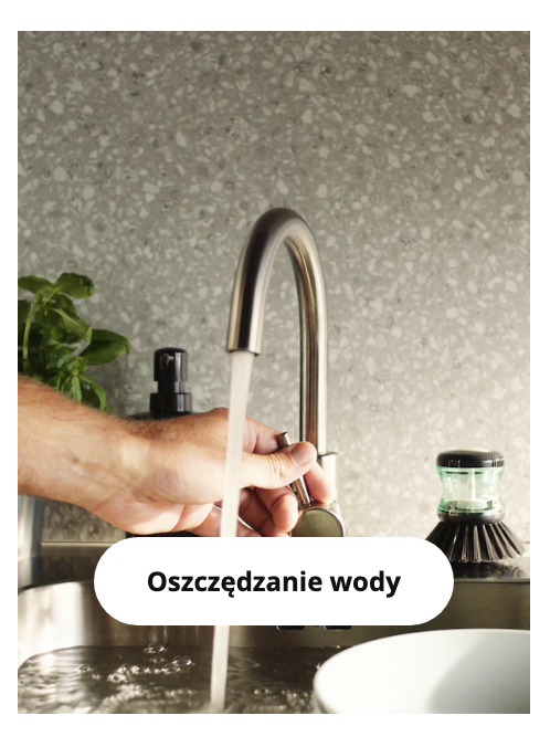
Alt = "Hand of a person adjusting the flow of water from a kitchen faucet with a curved spout. In the background, a gray wall panel and a plant in a pot."
Page Language
The language on the website has been correctly specified. Thanks to this, assistive technologies know exactly how to process the content contained in the website and convey it to their users (Link opens in a new window. 3.1.1. WCAG).
<html lang="pl-PL" [...]>
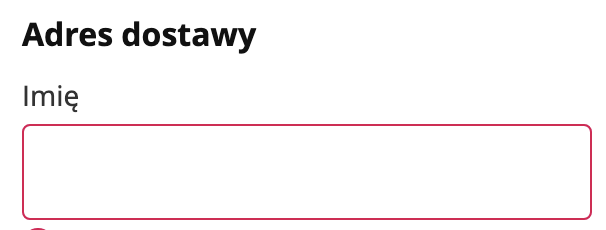
Labels for Form Fields
All fields in the online product ordering form have labels. This allows users using assistive tools to know exactly what information to enter to receive the ordered product (Link opens in a new window. 3.3.2 WCAG)
Two out of the six most common errors still appear on the website. However, I think that this can be partly justified by the large assortment of the store and frequent changes on the website, which means not all links have context. It’s worse with buttons – “add to favorites” is a constant, unchanging element… What happened, IKEA?
Let’s try to highlight more of the good things.
Skip to content
The store has a fairly extensive content skipping feature. It is possible to skip not only the navigation but also the lists in the middle of the page. This is a very convenient solution for people navigating the site using a keyboard (Link opens in a new window. 2.4.1 WCAG).

Focus Visibility
Another very important functionality for people navigating the site using a keyboard. The user needs to know which active element they are currently on. It is very well visible on IKEA (Link opens in a new window. 2.4.7 WCAG).

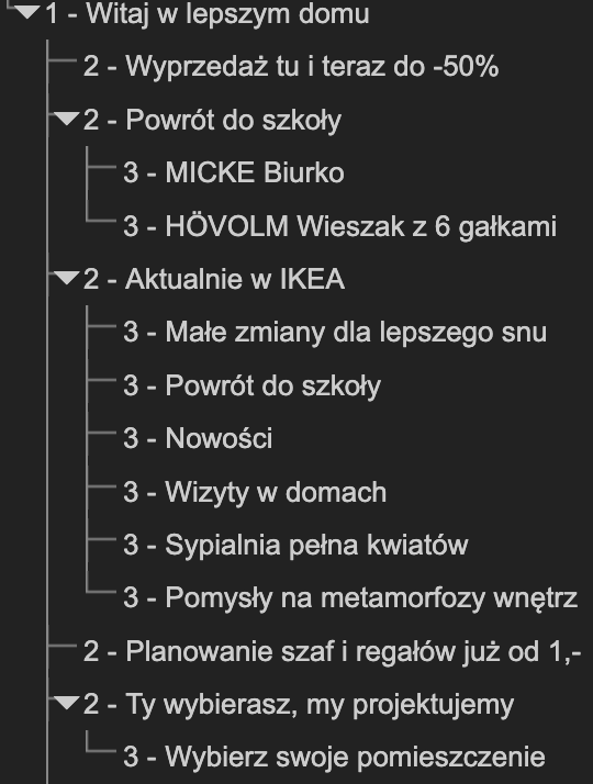
Headings
The headings on the homepage are well designed. They appear in the correct hierarchy and are logically organized. Their proper structure definitely facilitates navigation for blind users, who often check headings first (Link opens in a new window. 1.3.1. WCAG).
Responsive Design
The website can be used on both larger screens and mobile devices. The site is responsive and adapts to the screen width. The user can browse the site without losing content. Nowadays, this is very important. The popularity of mobile devices is still growing, and many users make purchases using their phones (Link opens in a new window. 1.4.10 WCAG).
Why Design an Accessible E-commerce?
There are many reasons why it’s worth making a website accessible. When the pandemic broke out in 2020, a huge number of people were afraid to leave their homes. As a result, they opted for online shopping, which is not only convenient and safe but also available around the clock. Users can shop wherever and whenever they want. Another argument was the best price – often competitive compared to brick-and-mortar stores.
According to Gemius, in 2021, 77% of Internet users also shopped online. Currently, 76% of e-consumers shop using their smartphones, compared to only 37% in 2015.
Until recently, accessibility was optional and treated with reserve. Since 2019, this has begun to change, since public entities were obliged to be accessible based on the Act of April 4, 2019, on the digital accessibility of websites and mobile applications of public entities. Private entities have more time for this – until June 2025. What then? Mainly financial penalties.
Furthermore, accessible e-commerce attracts even more users, including those with disabilities. The conclusion is simple: the more users, the greater the profits. Especially since the competition is huge.
On a side note, in early August of this year, we prepared another accessibility report – this time focusing on banking (Link to the page where you can download the report – Link opens in a new window. https://kinaole.co/dostepnosc-bankowosc/).
Do you want your e-commerce to be accessible? Or perhaps you run another business and want to reach a wider audience? Feel free to contact us! https://kinaole.co/kontakt/.

Małgorzata Szymczak
Accessibility Specialist & Junior Frontend Developer
Recommended articles
-
 19.02.2023Accessibility
WCAG 2.1 – Criterion 1.2.6 – Sign Language (Level AAA)
Today, we focus on another accessibility criterion – 1.2.6 – sign language (Level AAA). Do you remember the recent awards…
-
 22.04.2024Accessibility
There is no sustainability without accessibility… and vice versa
Accessibility and sustainability go hand in hand with digital products. Our digital products benefit the environment and society when we…
-
 03.04.2023Accessibility
WCAG 2.1 – Criterion 1.3.1 – Information and Relationships: (Level A) Part 3
It’s Friday so let’s start with our schedule! Another WCAG-related post – the third part of criterion 1.3.1! Speaking of…